A few years ago, a friend, who also worked at an advertising agency, asked me, rather out of the blue: ‘As a designer, what do you think is the best logo you know?’ Well, I was surprised. Not only anyone had ever asked me this, but more surprising to myself, it never had come to my mind or even think about this. Though I was in design for 10 years at that time.
I didn’t wait to long to answer: ‘Coca Cola’. He reacted surprised on my answer. He told me that no one, as up yet, had said Coca Cola. It was more commonly to get Pepsi as answer. I was the first to answer one of the most classic brands instead of a more modern design logo, like Pepsi.
That got me started thinking over the years. From time to time that question popped into my mind, and I tried to answer as quick as possible to maintain the most objective as I could be. I off course wanted to know if my taste would change. Well, in my opinion the Coca Cola logo is one of the best logo’s ever designed. But there are more. And so I came up to make a list of my own Top 3!
First we need to have a set of rules first to judge it by.
I think a logo should measure to these 4 values:
A. Aesthetic
B. Balance
C. Branding
D. Coolness
Let’s begin. The first runner up.. drum roll ……..
#3 PS2 logo
This is a very beautiful example of modern lined logo, I very much like the simplicity and elegance of this logo and it’s functional as well. On the branding side the design is very recognizable and met the industrial design of the player.
#2 Coca Cola logo
The Coca Cola logo is one of my old time favorites. It’s famous it’s elegant and it’s authentic. I love calligraphy and
logo’s that don’t change over time, because they are such a timeless image. The Coca Cola logo, has all of that and everybody knows this brand by just seeing the shapes of the logo. Very cool!
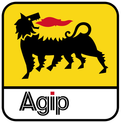
#1 Agip logo
And the #1 logo is the Agip logo. It’s because it’s beauty, it’s insanity, but above all it’s world-famous and how did they ever come up with this!? The logo, well you can see it, consists of a dog with 6 legs spitting fire backwards. Besides this, the text is written in an Helvetica op outline, typographically a no go. And still all these ludicrous elements added up, make this beautiful logo.
Yes it is, according to me, the most beautiful logo. It is aesthetic, in balance, a brand on it’s own and because of all the not done elements added up super cool!
Don’t you think so?
Let me know your own Top #3!


